Bonzun
Bonzun's main product is a pregnancy app called My Pregnancy – an app that helps pregnant people understand their pregnancy health by providing information. Soon, two more products would be coming out: an app for IVF treatments and another one for early parenting.
Problem Bonzun had was that their own visual identity and the identity of the app were not in line. The connection between the product and the brand was vague and inconsistent. Communication on Bonzun's website differed from the communication on the app.
At Lobby Design I got to be a part of Bonzun's brand lift by polishing their brand platform together with my colleague Madeleine Engelbrecht, as well as creating the new visual identity. The outcome of our work would help Bonzun improve their brand awareness in all platforms.
Client: Bonzun
Mission: Brand strategy, visual identity design, Art Direction, web layout, app layout, print material
Date: 2019
The goal of the project was to help Bonzun lift their brand by defining the brand platform and creating a coherent, strong visual identity. Connection between the brand and its products had to be made apparent and the communication consistent.

Through research and competitor analysis we came into a conclusion that there is a potential for an app that is niched for health and security.
There are a lot of competitors in the market for pregnancy apps. Most of the competitors provides apps full of functions from photo galleries to pregnancy diaries. All fun and interesting functions but essentially irrelevant for an app that exists to save lives.

App icons of some of Bonzun's competitors
The goal for Bonzun's identity design was to convey an image of a leading brand in pregnancy health. This goal was approached by drawing inspiration from clean, Scandinavian design.
The identity needed to allow all the three categories to be independent yet consistent.
Logo design
Bonzun's new logotype got its inspiration from the previous app icon, taking it to a simplified, minimalistic form. The symbol combined with bold typography created a logo that can stand out in all platforms.
The logo exists only in black and white. This is to keep it as clear as possible and stand out from the competitors.
The original app icon
New logo
New app icon


Brand colors
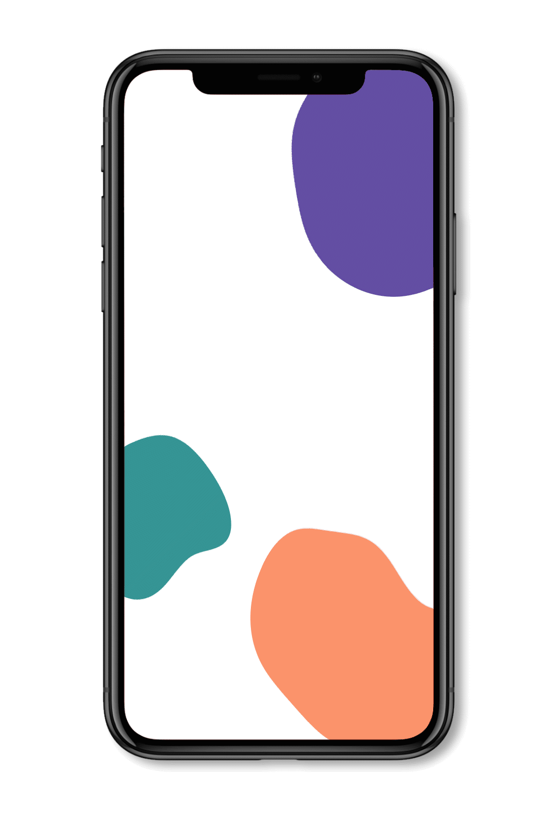
Bonzun's primary colors are black and white yet the identity as a whole is colorful. Each product – Bonzun IVF, Bonzun Pregnancy and Bonzun Baby – have their own main color. Purple for IVF, coral for Pregnancy and teal for Baby.

Brand animation
Brand shapes and animation
To bring the identity to life I designed brand shapes and animation. The shape and its motion was inspired by anatomy – a womb in the process of expanding and evolving.
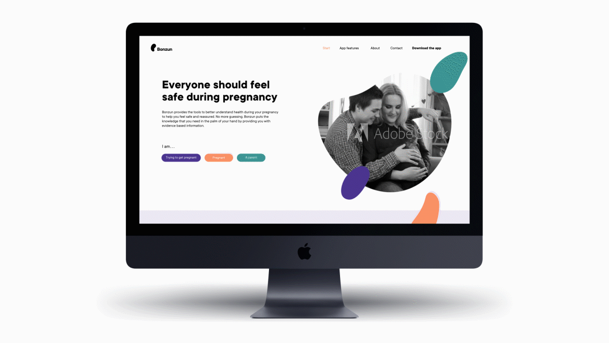
Structure and layout design for web

Layout for Instagram profile
"Everyone should feel safe during pregnancy."

Campaign material proposal
In material that communicates Bonzun's brand in general, the brand shapes appear in all three colors together with a black logo and typography.

Stationery
Materials presenting the products are coloured according to their category. This together a white logo and the brand shapes creates a colorful and recognisable identity system.


Facebook Carousel Ads
